The objective of this first project was to create a french fold/8 page booklet to visually represent a classmate's personality using analog and digital imagery. We were asked to include three specific items into our composition:
ICON - a digital photographic portrait
INDEX - a digital scan of a 3 dimensional object provided by our subject
SYMBOL - digital conversion of an original analogue numeral
We began by interviewing our subject/client to determine unique characteristics and things of interest. We discussed personality keywords/adjectives and choose 5 to include on the front page of our final layout.
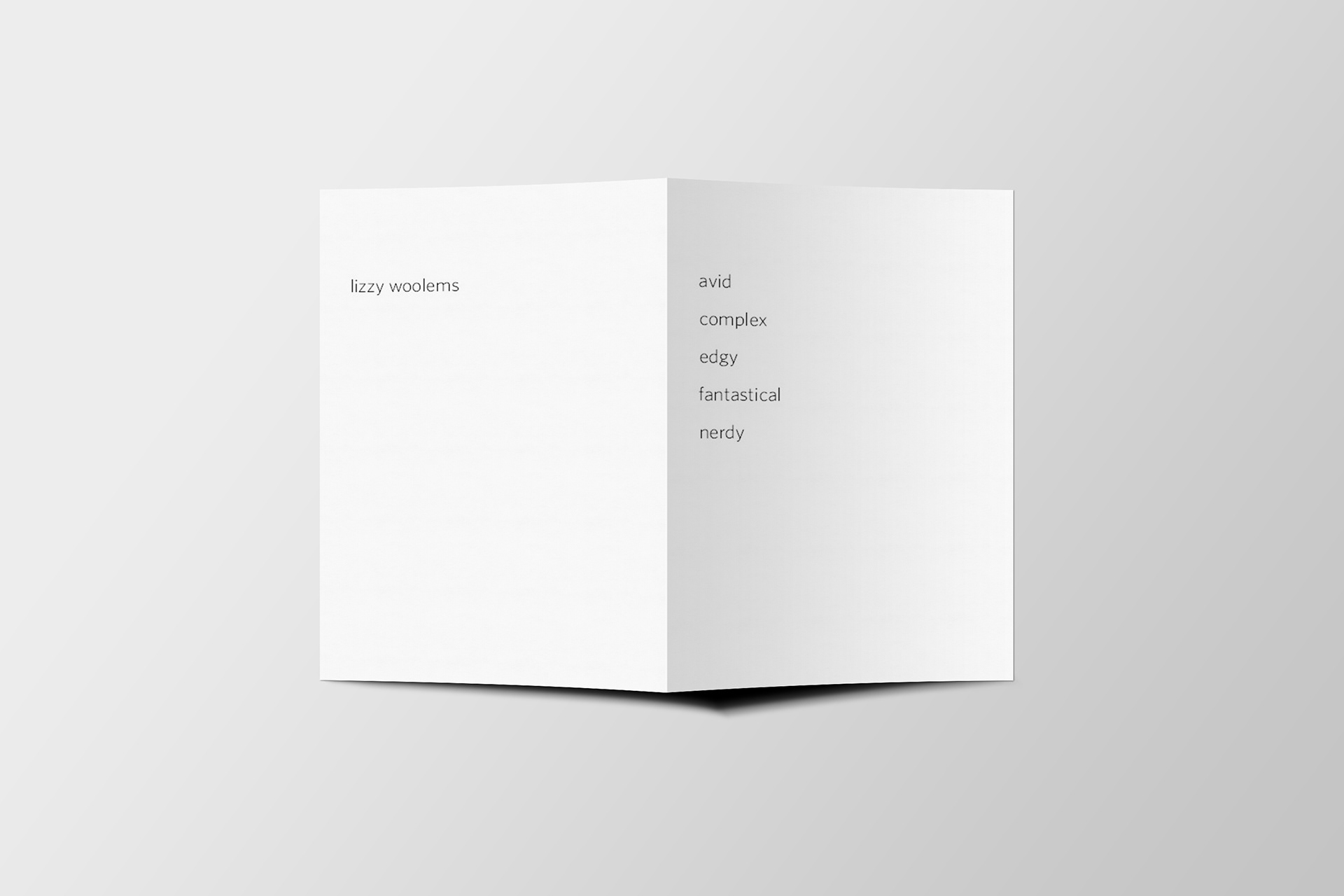
LS/Back: Name our our subject/client
RS/Front: 5 keywords/adjectives that describe our subject/client
The next step of this process was to collect a 3-dimensional object from our client/subject and scan the object. My client choose a Kanzashi which is a Japanese hair chopstick. Once this item was scanned we were asked to extract the image from the background and experiment for different color and treatment variations for the image (monotone, duo-tone, and filtered/manipulated full color). I began with enhancing the color of the original image and then applying a filter through Photoshop to create a drawn effect. The background texture was created through the block-printing process that was used for the numeral shown below.
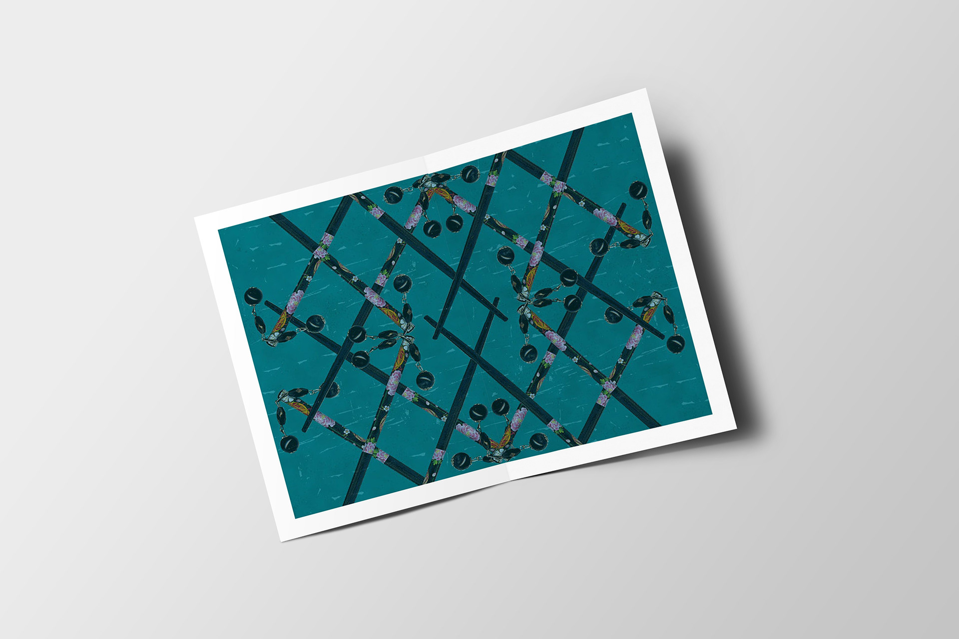
1st Fold showing the 3-dimensional object provided by our subject/client
We were asked to take several digital portraits of our subject/client, making sure that it would communicate one of the keywords/adjectives chosen previously. Once the portrait was decided upon, I cut my subject from the background and began experimenting with different versions (monotone, duo-tone, and filtered/manipulated full color). I decided to apply a duo-tone with several Photoshop filters including a poster edging effect.
The numeral was determined by the subject's birth order and was created from a sketch and then carved/cut using the block printing method. The prints were scanned and then placed in the composition. The background texture was created using a halftone effect on the blue-green color and then portions of the block print were cut and pasted to create the dark and light pink textures.
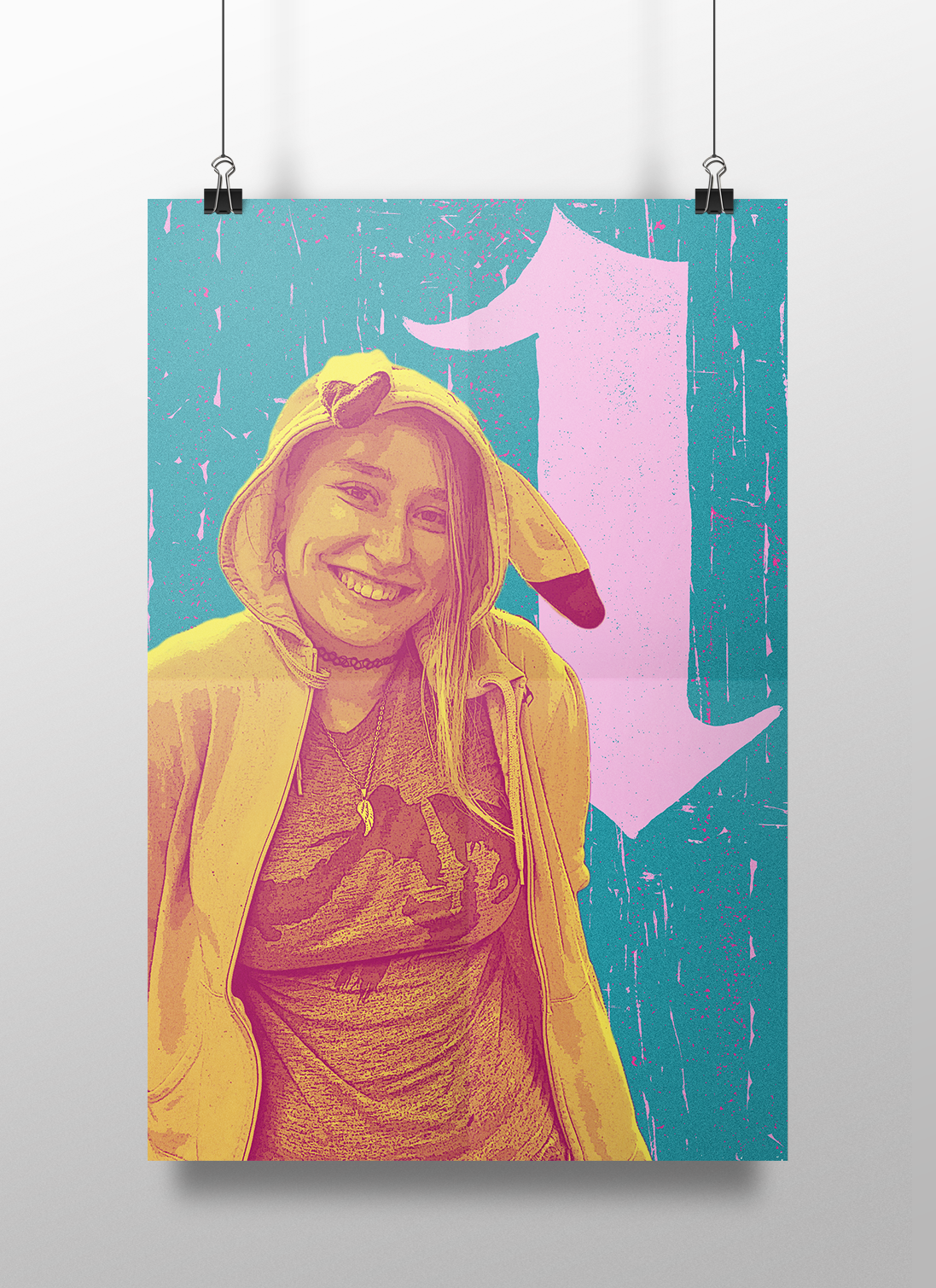
Inside poster at full size showing the portrait and birth order numeral of our subject/client
I chose to create the composition using a triad of magenta, yellow and blue-green. Magenta is the subject's favorite color and she is wearing a Pokemon sweatshirt which I wanted to keep yellow. The Kanzashi also had pink and yellow which lent itself nicely to the color scheme.
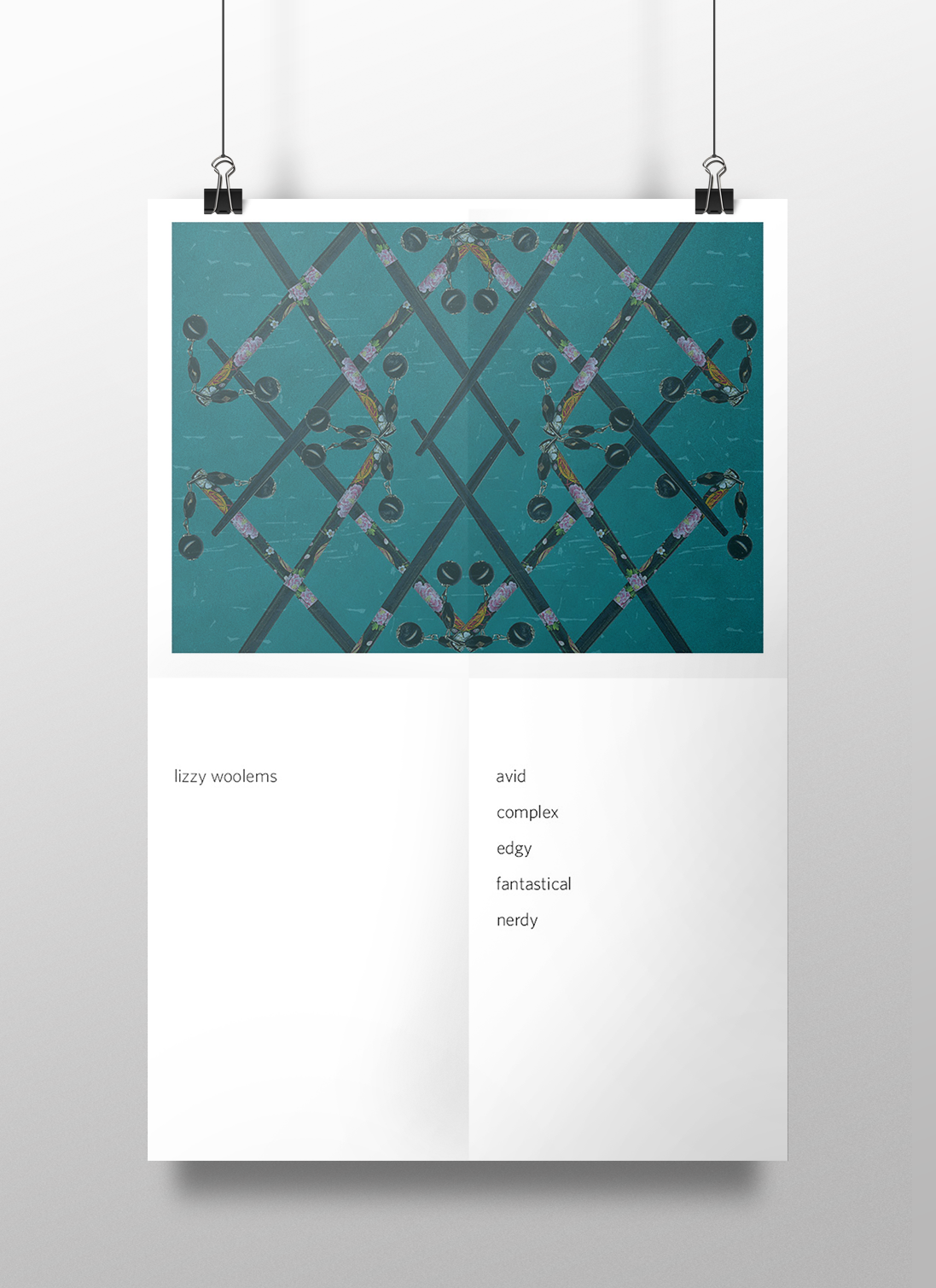
Outside poster at full size which includes the first two spreads as described above.
If you would like more information regarding my research, design process, and additional mock-ups, please follow this link.